The cursive j remains one of the toughest letters to write well, even as schools put less focus on handwriting these days. Many schools don’t teach this beautiful writing style anymore. Still, educational platforms like K5 Learning distributed millions of cursive practice sheets last year, which shows people still want to learn this valuable skill.
Students often mix up the cursive j with other letters in the alphabet, especially when you have to write a capital J. Many new learners can’t tell the difference between a cursive capital J and a capital G. This piece will show you the right way to write both uppercase and lowercase cursive j. The techniques come from time-tested methods like the Palmer Method (1888 old) and the D’Nealian style that U.S. elementary schools commonly use. These fundamentals are the foundations of becoming skilled at writing the whole alphabet in cursive.

Table of Contents
Understanding the Basics of Cursive J
Learning to write a cursive j means you need to know its special features and how to form it. The letter j looks quite different from other letters in the cursive alphabet. You’ll need to learn specific rules for both uppercase and lowercase versions.
Why cursive J is often confused with G
People mix up capital J in cursive with capital G because of old handwriting methods and how similar they look. The Palmer Method from 1888 made these letters look almost the same. Many Americans who learned cursive years ago say these two letters seem “switched” from what they learned.
This mix-up isn’t just something people say. The cursive capital J has a big loop and goes down in a way that looks like what most people expect a capital G to be. New writers often pause when they try to write or identify these letters.
The mix-up started because cursive writing changed over hundreds of years. English has used cursive since before the Norman conquest. It grew through different styles like secretary hand, which people used a lot in England from the early 1500s. These changes made some similar letters harder to tell apart.
The G/J confusion grew because cursive writing wasn’t the same everywhere. Edward Cocker brought French ronde style to England. John Ayers and William Banson then developed it into “round hand” throughout the British Empire in the 1600s and 1700s. Different regions taught and wrote these letters in their own ways.
D’Nealian cursive is what most American elementary schools teach now. Students still find it hard to tell these capital letters apart, even with standard teaching methods.
Uppercase vs lowercase J in cursive
The j in cursive looks different in uppercase and lowercase. Each version follows its own rules and has its own job in writing.
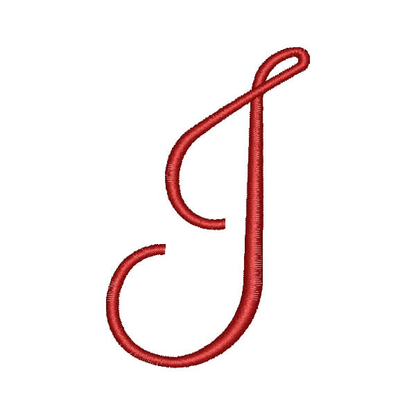
The cursive capital J starts at the bottom line with an upward stroke that curves left. It reaches the top line, then slopes down. It often goes below the bottom line before connecting to the next letter. This makes it one of the trickiest uppercase letters in the cursive letters alphabet.
The lowercase j cursive is much easier to write. It starts at the base line and curves up to make a loop. Then it curves down past the baseline with a small tail. The lowercase j goes below the baseline, which writers call a “descender.”
Here’s what makes uppercase and lowercase j in cursive different:
- Where they start (both begin at the baseline but go different ways)
- How complex they are (uppercase needs more strokes)
- How they connect to other letters
- Their size and how they fit with other letters
Teachers show that the lowercase j has curves that students can trace and practice on their own. The cursive j uppercase needs more practice time because it’s harder to form and connect.
Writing cursive capital J with lowercase letters needs the same slant and spacing to look good. These details help make cursive writing look nice and easy to read.
Once you know both j forms in the alphabet in cursive, you can write smoothly and connect letters naturally. That’s why cursive became popular – it’s the quickest way to write compared to printing letters one by one.
How to Write a Cursive J Step-by-Step
Learning cursive j focuses on fluid motion rather than rigid strokes. The capital J in cursive might look challenging at first, but a step-by-step approach makes this elegant letter easy to master.
Starting point and original stroke
The capital J in cursive needs precise positioning to create a solid foundation. Your pen should rest at the baseline (some teachers call it “the floor”). Create a gentle upward stroke that curves slightly left and reaches the top line or “ceiling”. This upward movement should feel smooth and natural to establish the letter’s graceful character.
The lowercase j in cursive takes a slightly different path. Start at the midline or a bit above it. Some styles suggest beginning at the baseline with a small upward curve toward the midline. This position is vital since it shapes your finished letter’s proportions.
The stroke needs a consistent slant—this uniform angle substantially adds to your cursive alphabet letters’ elegance. U.S. schools commonly teach the D’Nealian cursive style, which emphasizes this consistent angling.
Loop formation and tail direction
After the original stroke of a cursive capital J, move into the distinctive loop. The downward slanting stroke should extend below the baseline into what teachers often call “the basement”. This descending tail creates the letter’s unique look, setting it apart from other cursive letters alphabet.
The lowercase j cursive needs a small loop or circle at the top after the original upward curve, just as with the lowercase print j. The downward stroke extends below the baseline and usually has a slight curve or hook at the bottom.
Balance and proportion make both forms work well. The cursive j uppercase should show harmony between its upper curve and tail. Let the descending part flow naturally from the upper section to create visual balance.
New learners often find it hard to keep fluid motion while making loops. You should practice the movement many times. Focus on smooth transitions between strokes before trying to make perfect forms. Size, spacing, and slant need consistency to look polished.
Ending the letter cleanly
A clean finish on your cursive j helps connect with other letters smoothly. The capital J in cursive ends with a crossover at the floor where you started. This creates a small loop extending slightly right, ready to connect to the next letter.
The lowercase j in cursive curves back toward the baseline after its below-baseline tail. This return stroke connects smoothly to the following letter.
Standalone letters need a definitive yet graceful final stroke. Words like “joy” or “jam” flow better when the tail naturally extends right into the next letter.
Master each stroke before writing the complete letter. Once you feel comfortable with the basic movements, try different styles to develop your unique approach. Your cursive j will flow naturally from your pen with regular practice as muscle memory takes over.
Common Mistakes When Writing J in Cursive
Even skilled writers have trouble with the elegant curves of a cursive j. You can improve your penmanship by knowing and steering clear of common mistakes. This classic skill deserves a place in your professional toolkit.
Mixing up capital J with capital G
The cursive alphabet can be tricky, especially when it comes to telling capital J and G apart. Americans who learned cursive in the early 1960s often feel surprised at how these letters look “switched”. This mix-up makes sense because both letters share similar shapes.
The Palmer Method (developed in 1888) shows the capital G in cursive as a bigger version of its lowercase form. It features a fancy back-and-forth motion in the tail. The cursive capital J evolved differently but kept some features that people often mistake for a G.
D’Nealian cursive, which many American schools teach, makes the difference clearer, but some confusion remains. Business professionals who want to use formal handwriting need to practice these letters carefully.
It’s worth mentioning that handwriting styles vary by region. Scripts outside the United States follow different rules. German handwriting uses simpler forms that might look strange to American readers. This becomes extra important in international correspondence.
Incorrect loop size or angle
Letter shapes aren’t the only challenge. Writers often mess up the lowercase j in cursive by making loops that are too big or too small. This small mistake can make your writing hard to read and less attractive.
Pressure control also trips up many writers. Pressing too hard breaks the natural flow of cursive writing and creates uneven lines in your j cursive forms. A lighter touch usually works better.
The cursive j uppercase gets messy when writers lose track of their starting point. This creates sloppy overlaps instead of clean connections. Start at the baseline (“floor”), go up to the top line (“ceiling”), and make a small loop that connects right back where you began.
Keeping your slant angles the same throughout the cursive letters alphabet can be tough. Different angles make your writing look choppy instead of flowing smoothly. This shows up most in letters with big loops like the j in cursive.
You can fix these common mistakes by practicing carefully. Your reward will be smooth, professional cursive that looks great on formal letters and important documents.
Practicing Cursive J with Worksheets and Words
Learning the cursive j takes practice to master. You need to understand how to form it and avoid mistakes. Regular practice with the right approach will help you write this challenging letter naturally.
Using cursive practice sheets effectively
Cursive practice sheets give you many options to learn the j in cursive. These worksheets come with:
- Tracing lines that fade away to help you write independently
- Steps showing the right stroke order and direction
- Clear marks showing where to start
- Different sections to help you practice
Read the letter formation guide carefully before you start writing. Start by tracing the letters on the sheet and focus on smooth movements rather than speed. Try writing the letter by yourself in the empty spaces. Look back at the example if you need help.
Some high-quality worksheets show both uppercase and lowercase versions together. This lets you practice the capital J in cursive right next to its lowercase form. Writing both versions helps you understand how they fit into the cursive alphabet.
Short practice sessions work better than long ones. A light box can help you see guidelines through blank paper. This makes it easier to write consistently as you move away from printed sheets.
Practice words starting with J (e.g., James, jog, jumbo)
Writing complete words with the j cursive helps you apply what you’ve learned. Words like James, jog, jewel, and jumbo let you practice connecting the j in cursive with other letters.
James works great for practice because it combines the cursive capital J with common lowercase letters that flow well together. Words like jog and jumbo help you learn how to connect the lowercase j in cursive to round letters that come after it.
Focus on these points while practicing words:
- How the j connects to the next letter
- Keeping all letters slanted the same way
- Spacing letters correctly so they’re easy to read
Make your own list of words that start with j. This helps you get comfortable using this letter in different ways and naturally adds it to your everyday cursive letters alphabet writing.
Integrating Cursive J into Full Sentences
The cursive j reaches its peak complexity when used in complete sentences. Students who feel confident with individual letters face a new challenge: they need to create smooth connections while keeping their writing consistent throughout longer texts.
Connecting J with other cursive letters
The j in cursive connects to other letters differently based on its case. The capital J in cursive starts at the baseline and moves up, curves left, reaches the top line, then slants down. It crosses the baseline before it links to the next letter. Writers need good baseline control to keep their script flowing.
The lowercase j cursive links to other letters naturally after its tail. D’Nealian cursive shows that writers should curve back up toward the baseline after making the downward stroke below it. This upward motion lets the pen flow into the next letter.
Different letter combinations create unique challenges:
- Words like “jump” need the lowercase j to connect straight to the u at the baseline
- “Jeff” needs a small pause between the capital J and the e
- “James” shows how the uppercase J flows into the lowercase a
Writing full names and phrases with J
The cursive j shines when used in complete words and phrases. Name writing gives students great practice opportunities. Most 8-9 year olds start with names like James, Jayne, and similar J-names. This hands-on practice helps them write more smoothly and connect letters better.
Students develop their grammar and punctuation skills as they write full sentences. Their cursive alphabet skills improve at the same time. Writing becomes automatic with practice. Students move from thinking about each letter to writing whole words naturally.
Time tests prove that cursive writing beats even the fastest print writing. The beautiful curves of the j in cursive change from tough letter shapes into natural ways students express themselves.
Learning to write a cursive j takes patience and steady practice. We have explored everything from simple formation techniques to advanced sentence integration in this piece. The difference between capital J and G often trips people up, but regular practice makes this confusion fade away.
Beginners can build strong foundations with our step-by-step approach. Practice makes perfect when you use the right materials. Worksheets are a great way to get guidance, and practice words like “James” and “jumbo” help your muscles remember letter connections.
Your progress from basic letter formation to smooth sentence writing shows natural development. Modern schools might not focus on cursive writing as much, but this skill remains valuable. A well-formed cursive j shows your attention to detail and adds a personal touch to handwritten notes.
Students should push through their original struggles. What feels hard now will become natural with time. Cursive writing starts as a technical skill and grows into your personal expression. The time spent practicing letters leads to effortless writing that makes all the work worth it.
Here are some FAQs about the cursive J:
How to make the letter j?
To make a cursive j, start with a small upward curve and then create a downward stroke that dips below the baseline. Finish with a dot above the letter to complete the j in cursive. This letter is unique because it’s one of the few lowercase cursive letters that extends below the line and requires a dot.
How to type capital J?
When typing a capital J, simply press the ‘J’ key while holding the shift key to create a standard printed J. For a cursive capital J in digital formats, you may need to use special fonts or character sets that include stylized j cursive letters. Many word processors offer cursive or script fonts that include proper capital j in cursive forms.
How to write a big J?
To write a big J or cursive capital J, start at the top line and create a large, elegant downward curve that loops to the left at the bottom. The capital j in cursive often includes a horizontal crossbar at the top and sometimes a small tail to connect to the next letter. This j cursive form is more decorative than its printed counterpart.
How to write a capital J in print?
Writing a capital J in print involves making a straight vertical line down from the top, then adding a small horizontal line at the top and a curve at the bottom. Unlike the cursive capital j which flows continuously, the printed version is more angular. Both forms are distinct from the lowercase j in cursive which has a dot and descender.
How to make a cursive j?
Creating a proper j cursive letter requires starting with a small upward stroke, then making a downward line that curves below the baseline. The lowercase j in cursive always includes a dot placed above the main stroke, similar to the dot on a printed ‘j’. This letter connects to the next character with a small upward flick at the bottom.
How to make simple j?
For a simple j, use the printed form: a vertical line with a dot above and small curve at the bottom. The j in cursive is slightly more complex with its below-the-line tail and connecting stroke. Beginners learning j cursive might start with the printed form before attempting the flowing cursive version.
How do you write J on line?
When writing J on lined paper, the lowercase j in cursive should touch the top and bottom lines, with the dot placed in the upper section. The cursive capital J typically starts at the top line, extends to the bottom line, and may have flourishes that go slightly above or below. Proper j cursive formation maintains consistent size with other letters.
Do you capitalize J in junior?
Yes, you capitalize the J in “Junior” when it’s part of a proper name (e.g., John Smith Jr.). The capitalization rules apply whether using print or cursive capital j. In signatures using j cursive, the capital J in “Junior” would be written with the appropriate cursive capital j form.
What number is J on keyboard?
The letter J doesn’t have a specific number value on standard keyboards, though it’s the 10th letter in the English alphabet. When typing, you’ll find the j key on the home row of QWERTY keyboards. For special j cursive characters in digital documents, you may need to use character codes or select from special font sets that include cursive capital j variations.