The cursive f is one of the toughest letters to get right. These days, cursive writing is becoming a lost art in schools all over the United States. Still, knowing how to write with elegance has its value. Beginners often struggle with the cursive “f” and make many mistakes on their first tries.
Getting good at writing both lowercase and capital f in cursive takes practice and the right guidance. The D’Nealian cursive style, which most American schools teach, shows specific ways to form each letter correctly. On top of that, it helps to watch instructional videos and use practice worksheets to improve your cursive f writing by a lot. This piece breaks everything down into simple steps that help beginners tackle the unique challenges of this tricky letter.
Table of Contents
Understanding the Basics of Cursive F
The cursive letter F brings together art and function in handwriting. This unique letter challenges writers with its structure but gives them elegant flowing strokes. Learning the basics helps you master this tricky letter.
What makes the letter F unique in cursive
The cursive F stands out with its flowing design and how it connects to other letters. The uppercase F in cursive has a unique structure that doesn’t end at the baseline. It’s one of the few capital letters that won’t connect to letters that follow. You need to pay special attention when you use it in words.
The lowercase f in cursive has a tall, slender form with a loop at the top and a crossbar in the middle. It flows into the next letters, which makes it easier to use in connected writing. The cursive f comes in different styles. D’Nealian shows a modern approach while Zaner-Bloser follows a traditional style with fancier elements.
The letter’s loops and curves create a shape you can spot right away. It shows classic penmanship but works well for everyday writing.
Differences between print and cursive F
Print and cursive versions of F look and work very differently. Print F uses straight lines and sharp angles. The cursive F uses flowing curves and loops that help you write without lifting your pen.
The capital F in print looks like a simple two-bar structure with straight lines. The cursive capital F starts with a horizontal stroke from left to right at the baseline. Then it goes up in a vertical stroke and has a middle bar that connects to the vertical stroke. This change lets you write faster and smoother than block letters allow.
The lowercase f changes even more. Instead of the simple straight-line-with-crossbar print form, the cursive version:
- Has a tall loop above the midline
- Has a special crossbar in the middle
- Often goes below the baseline with an elegant curve or tail
- Connects naturally to the next letters
This new design lets you write faster by lifting your pen less while keeping your writing clear.
Why cursive F is often considered difficult
The cursive F is one of the harder letters for beginners to learn. It looks very different from the print version most people learn first. Writers must learn what feels like a completely new symbol.
Both uppercase and lowercase cursive F need careful control. The lowercase f needs extra attention to stroke direction and pressure. Many writers find it hard to make fluid loops and connections. Common problems include:
- Keeping the same slant through the letter
- Making the loops look right
- Connecting smoothly to other letters
The capital F in cursive needs even spaces between horizontal and vertical parts to look good. New writers often press too hard or rush, which makes the letter look odd.
Handwriting experts say the lowercase f can be “slightly tricky” and needs lots of practice. You need good coordination to make the loops, crossbar, and connections in one smooth move.
Practice and patience help you master the cursive F. The result is beautiful and efficient writing. With structured learning and regular practice, even this tough letter becomes natural.
How to Write a Lowercase f in Cursive
Learning to write a lowercase cursive f takes practice and careful attention. This letter’s looping structure makes it both beautiful and practical when written well. Let’s break this challenging letter into simple steps.
Step-by-step stroke breakdown
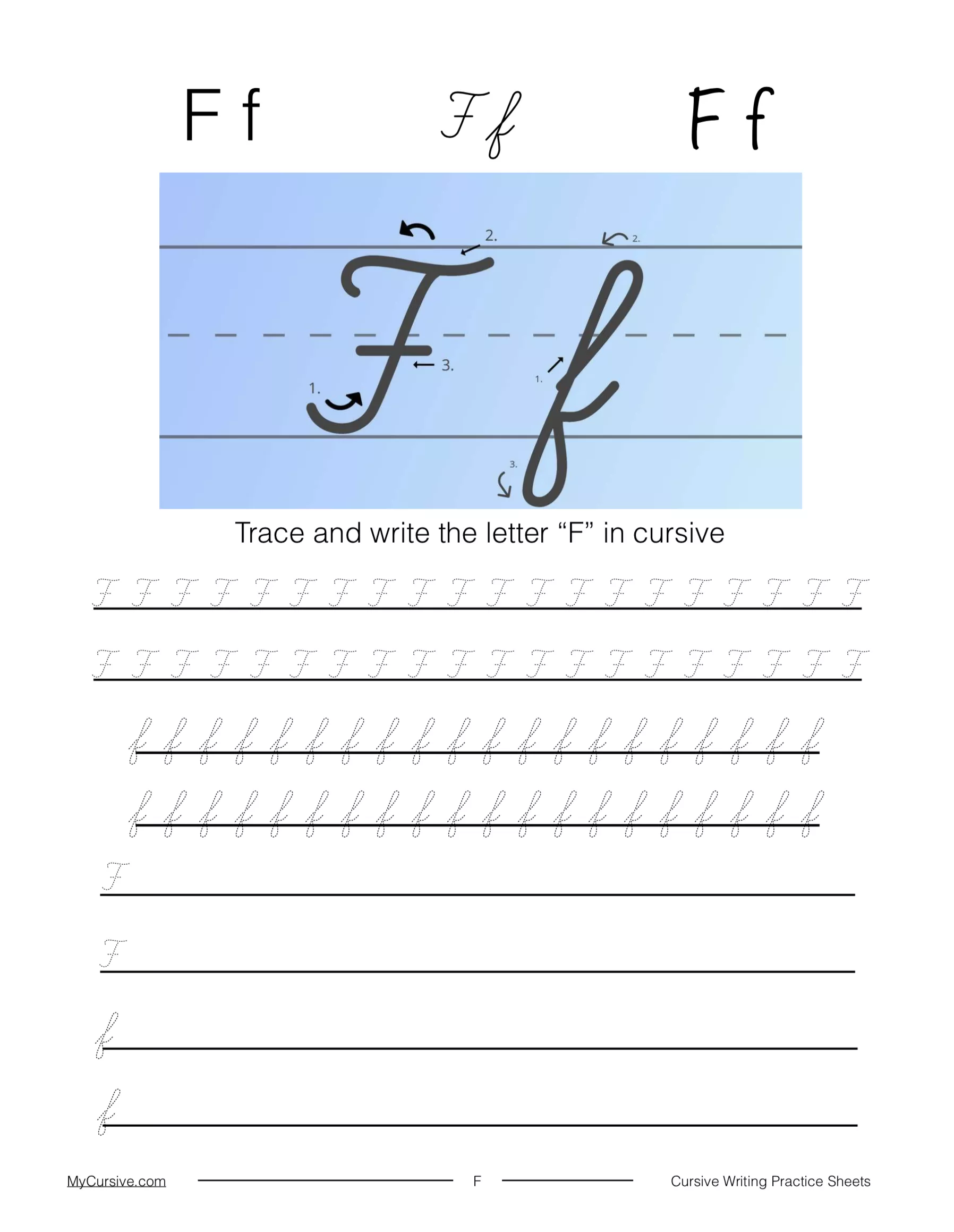
The cursive lowercase f is different from its printed version. Here’s how to position your pen or pencil:
- Starting position: Start at the baseline (the bottom line of your writing space)
- Upward stroke: Draw a smooth curve upward to the right until you reach the top line
- Downward stroke: Create a straight line downward through the baseline into the space below
- Return stroke: Move back upward and right until you reach the baseline again
- Connecting tail: Add a small tail to the right at the baseline that connects to the next letter
This creates the distinctive loops that make a proper cursive f. The letter stands out because it extends above the midline and below the baseline, making it one of the more complex letters you’ll write.
Common mistakes to avoid
The lowercase cursive f can challenge even experienced writers. Here are the most common mistakes:
Closure problems: Beginners often leave the tail of the f open, which creates a “bunny ear” loop. Your curves should form a long, loop-type shape that closes at the baseline.
Connection issues: The loop might not connect to the straight line properly or end up too small or large.
Baseline errors: The closure point might drift above the baseline or stay open, making your f look like a cursive b.
Inconsistent size and slant: Your f needs consistent proportions and flow.
Improper crossing point: Crossing too high disrupts the letter’s flow and appearance.
Tips for smoother writing
Your movements should be fluid and connected rather than choppy. These strategies will help you improve:
Regular practice: Repeated practice builds muscle memory.
Use proper body mechanics: Your arm and shoulder should move as you write, not just your fingers.
Tracing exercises: Start with tracing worksheets before you try freehand writing.
Watch demonstration videos: Visual guides help you learn proper technique and timing.
Practice in context: Master the isolated letter first, then practice writing f in complete words.
Multi-sensory approach: Write on sandpaper or in sand trays to learn the motor patterns better.
Focus on closure points: Watch where lines meet at the baseline for proper letter formation.
Remember to be patient while learning the cursive f. You’ll need more practice with this letter than others because of its unique shape. Keep practicing and your movements will become natural, leading to a beautiful cursive f.
Mastering the Capital F in Cursive
The capital cursive F stands out as an elegant letter that gives writers a chance to show their skill. This beautiful character needs careful practice to get right. Let’s learn how to write this stylish letter in cursive.
How to write capital F in cursive
You’ll need to make specific strokes that look different from regular printing to write a capital F in cursive:
- Starting position: Start at the top line of your writing space
- First stroke: Make a downward stroke that curves slightly left as you reach the baseline to create the main vertical line
- Curve back: At the baseline, make a small curve that hooks back, like a J-hook
- Upper decoration: Go back to the top and add what teachers often call a “wavy hat” or elegant loop on the top part
- Middle crossbar: Add a horizontal line in the middle that crosses the vertical stroke
Your finished letter should look balanced with even curves and lines. This letter needs more practice than other cursive capitals because it’s more complex. Regular practice will help you develop the right muscle memory.
Variations in cursive capital F styles
The capital F keeps its basic shape, but you’ll find several style options:
D’Nealian cursive, which many American schools teach, offers a simpler version that’s available to beginners. You might also see:
- Looped tops that let you draw the letter without lifting your pencil
- Bigger curves that look more decorative
- Different crossbar positions
- Varied line thickness for calligraphy
You’ll end up creating your own style that shows your personality while staying readable once you know the basic form. Learning these variations can make your handwriting look more sophisticated after you’re comfortable with the standard form.
Connecting capital F to other letters
The cursive capital F has a unique feature – it doesn’t connect to the next letter. This makes it different from most cursive letters.
The letter ends with a small hook at the bottom where you should stop instead of continuing to the next character. To name just one example, words like “First,” “Free,” or “Fast” need you to finish the capital F, lift your pen, and start the next letter separately.
This break feels natural while keeping the cursive look. The bottom of the letter can curve back differently based on whether the next letter needs a high or low connection point:
- Low connections work with letters like a, e, i, and u
- High connections work with letters like o
Your cursive writing will look polished and professional while staying readable as you practice these connection patterns.
Practice Techniques for Letter F
Practice is the life-blood of mastering the cursive f. Research shows that handwriting difficulties affect up to 25% of school-aged children. Of course, anyone can develop elegant penmanship with mutually beneficial alliances and consistent effort.
Using tracing worksheets effectively
Tracing worksheets are the foundations of proper cursive f formation. The Cursive Sandwich Method works especially when you have students first trace a perfect model letter, then write independently, and finally trace another perfect model to reinforce proper form.
To get optimal results:
- Start with heavily guided tracings showing exact stroke order
- Move to dotted outlines that gradually disappear
- Progress to starting points with minimal guidance
- Complete multiple repetitions (some worksheets offer up to 84 practice spaces)
Downloadable PDF worksheets with both lowercase and capital F variations allow complete practice at home or in classrooms.
Freehand drills for muscle memory
Freehand practice builds significant muscle memory after students become comfortable with tracing. Yes, it is through repetition that the hand learns to form the letter automatically.
Students should focus on consistent size, slant, and proper closure points where lines meet during practice without guides. Multi-sensory techniques also improve retention—writing in sand trays or on textured surfaces reinforces motor patterns. Short daily warm-up sessions of five to ten minutes lead to most important improvements over time.

Incorporating F into full words
The final mastery stage comes from moving from isolated letters to full words. Simple words like “fish,” “frog,” and “food” make great starting points. These practice words target different connection challenges—flowing from f to i, r, and o correspondingly.
Students can progress to complete sentences after mastering individual words. Simple practice sentences might include “The fish ate the food”. Advanced practice can include tongue-twisters like “Five friendly frogs flipped, flopped and frolicked” that incorporate multiple f-connections.
Patience remains key throughout the learning process. One expert reminds us that “it’s important to realize this and not get too frustrated when first attempting to write it”.
Troubleshooting and Improving Your Cursive F
Mastering the cursive f can be tricky, even for dedicated writers. You need to spot and fix these challenges to keep getting better. Writers can turn this tough letter into their most elegant one by understanding common mistakes and finding ways to fix them.
How to fix common errors
Several specific problems pop up when writing the cursive f. We noticed that closure issues at the baseline are a big challenge—many writers don’t close the tail right. This creates a “bunny ear” loop that makes the letter hard to read. The letter might look like a cursive b if the closure point goes above the baseline.
The capital F in cursive often suffers from uneven pressure that leads to inconsistent stroke width. Here’s what you can do:
- Keep your pressure steady through each stroke so loops and lines match
- Make sure the tail closes right at the baseline for lowercase f
- Start with slow writing to get the form right
The biggest problem is poor loop formation. Both lowercase and uppercase forms need careful attention to balance the loops. This takes good motor control and patience.
The right time to switch from tracing to freehand
You should switch from tracing to freehand writing step by step. Writers need to feel comfortable with letter formation through tracing before they write on their own. Research shows tracing helps people learn the right strokes before they try freehand.
The quickest way to progress starts with guided tracings that show exact stroke order. Next, move to dotted outlines, and finally to minimal guidance points. A great technique combines tracing with practice—trace a model letter, write it yourself, then trace another one to reinforce good form.
Tracking your progress over time
Progress tracking motivates you and shows where to focus next. A well-laid-out binder with all practice sheets helps you see how your writing develops over time. Some programs offer special features to track handwriting progress.
Look beyond just comparing how letters look. Check these things too:
- Letter construction accuracy
- Consistency in slant and spacing
- Flow between connected letters
- Overall legibility improvement
Progress takes time, but regular check-ins help spot areas that need work. Looking at samples over time lets you celebrate wins while finding stubborn issues that need more practice.
Learning to write the cursive letter F takes practice, good technique and real dedication. We’ve looked at what makes both lowercase and capital F tricky but rewarding to master. Many writers face challenges with the loops, connections and slant at first. These hurdles become easier to handle with good practice methods and close attention to detail.
A clear step-by-step method helps beginners tackle this complex letter confidently. Students should start with tracing worksheets before they move to freehand writing. The letter becomes more natural when you practice it within words and sentences. Writers can see their improvement clearly when they track their progress and work on specific areas that need attention.
The cursive F shows how beautiful handwriting can be as an art form. Our digital world dominates communication today, but cursive writing’s elegant strokes still matter for self-expression and brain development. You need patience as you learn. Each time you practice builds on what you’ve done before. Your awkward first attempts slowly turn into smooth, confident strokes. When you become skilled at writing the cursive F, you’re not just learning a letter – you’re discovering an appreciation for a timeless skill that’s both practical and artistic.
Here are some FAAs about the cursive F:
How to make f in cursive?
To make an f in cursive, start slightly below the top line and create a small upward curve that loops back down below the baseline. The lowercase f cursive should have a crossbar in the middle and a tail that curves to the right to connect to the next letter. This distinctive shape makes the cursive f one of the more challenging letters to master.
How to write f perfectly?
Writing a perfect cursive f requires practicing the looped top, straight descending line, and centered crossbar. For the capital f in cursive, add more elaborate flourishes including a larger top loop and often a second crossbar. Consistent practice with the f cursive form will help develop muscle memory for this unique letter.
How to write letter F for beginners?
Beginners should start with the lowercase f in cursive by making a small upward stroke, then looping down below the line with a crossbar in the middle. The cursive capital f is more complex, requiring a large top loop, downward stroke, and usually two crossbars. Using lined paper helps maintain proper proportions when learning f cursive writing.
How to write curly f?
The curly f refers to the cursive f which features elegant loops and flourishes. Start by creating a small upward curve that loops downward past the baseline, then add a centered crossbar. The cursive capital f takes this further with additional decorative elements, making it one of the most ornate letters in cursive writing.
How to write big f?
To write a big f or capital f in cursive, begin with a large counterclockwise loop starting at the top line. Bring the stroke down below the baseline, then add two crossbars – one near the top and another in the middle. This cursive capital f is often used at the beginning of sentences or for proper nouns in formal handwriting.
How to make cursive writing?
Cursive writing involves connecting letters with flowing strokes, including distinctive characters like the cursive f. Start by mastering individual letters such as the lowercase f in cursive and capital f in cursive, then practice linking them together. Maintaining consistent slant and letter proportions is key to developing beautiful cursive handwriting.
How do you write F in different handwriting?
The letter F appears differently across handwriting styles – in print it’s two straight lines, while the f cursive version has loops and a tail. The cursive capital f is particularly variable, with some styles adding elaborate flourishes or multiple crossbars. Calligraphic versions of f in cursive may include even more decorative elements.
What is v in cursive?
While focusing on the cursive f, it’s worth noting the cursive v is simpler, resembling a pointed wave shape. Unlike the complex f in cursive with its loops and crossbars, the cursive v is created with a single fluid motion. Both letters connect to others with a small tail, but the f cursive remains more challenging to write properly.
What is the fancy F symbol?
The fancy F symbol typically refers to the ornate cursive capital f used in calligraphy and formal writing. This version of the capital f in cursive often features exaggerated loops, multiple crossbars, and decorative flourishes. You’ll see this f cursive style in wedding invitations, certificates, and other elegant documents where decorative lettering is desired.